Since upgrading to the iPhone 5, the added row of applications has almost been more of a curse than a blessing.
With my iPhone 3G (AT&T), which I kept for almost three years waiting for a Verizon iPhone, then finally an iPhone 4 (Verizon), for a little over two years, I had nearly five years of refining and curating the exact app and folder position and content.
Now with the iPhone 5 all that refinement and curating has largely gone out the window.
I have found that in organizing my iPhone home screen I have two primary goals or guidelines:
- I like to group my similar apps together. Work apps go together, as do music, photo, social, and so on.
- I also don’t want to put everything on my home screen in folders as that removes the quick access benefits of having them on the home screen.
With those goals in mind, finding the right set of 20, or so, apps is no easy feat. We all have application usage tiers. These tiers form and function very similarly to one’s circle of friends. The first circle of friends are those closest to you, whom you content regularly, and about whom you care a significant amount. As you progress through the circle of friends, the friends in subsequent circles become less close to you, you contact them less frequently, and you care about them less and less.
Application Tiers exist in the same fashion. With both friends and apps, the first tier or circle is not defined by a hard and fast number. I do not have on any given day exactly 20 (no more, no less) apps in my first tier. My first tier of apps is more likely to be closer to 12 or 15 apps leaving a more than a few spots unfilled on the new iPhone 5 home screen.
You might be thinking, “why not just pull from the second tier of apps to fill the spaces?” That is the natural progression of logic in this case, however my second tier of apps is larger than just three or four apps. That being the case, I would then need to create a sub-division of my application tiers in order to fill up the home screen of the iPhone 5. Not only is this not necessarily easy to accomplish it also has a high potential of infringing on one or both of my goals/guidelines.
And so continues the journey or iPhone 5 home screen perfection. Too many spots to either force me to use folders, like I did on my previous iPhones, and too few spots to fit all of my tier one and two applications.
This whole effort would be simplified if Apple would allow usage stats to be exported. This way I could see how frequently I open the applications on my phone allowing me to use actual statistics to help me refine my home screen. To my knowledge, as of the publishing of this post, no such app exists for a non-jailbroken iPhone.
Another aspect of this is that I desire multiple apps to fill the role of one. The best examples of this are the Weather and Accuweather apps, since neither are right I take the pessimistic Weather app and the optimistic Accuweather app and average them out. Another example is Waze and Google Maps. Google Maps, of course, owns the way-point and ideal driving directions but Waze has better, community driven, traffic and hazard reporting.
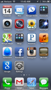
As to not bore you further, here is how my home screen stand as of January 14, 2013. I am sure this will change in the coming days or even hours. I am currently questioning the need to have Google Voice and Google Maps in their current position.